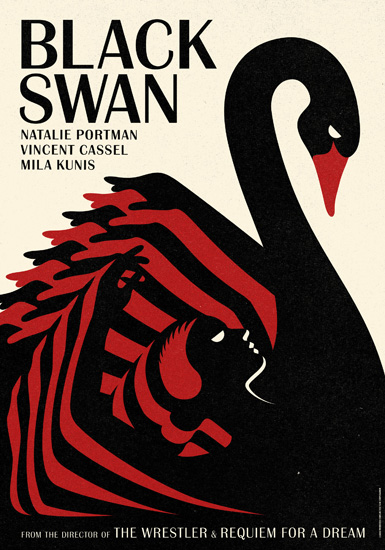
I always love sleek and simple designs. I think making an impactful statement using less is always better. I am inspired by simple designs using color and shapes to illustrate the message.

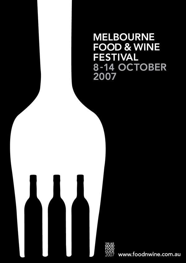
I always love sleek and simple designs. I think making an impactful statement using less is always better. I am inspired by simple designs using color and shapes to illustrate the message.
